> ## Documentation Index
> Fetch the complete documentation index at: https://wb-21fd5541-docs-3104.mintlify.site/llms.txt
> Use this file to discover all available pages before exploring further.
# Media panels
> Add and configure media panels for images, video, audio, 3D objects, and point clouds in a W&B workspace.
A media panel visualizes [logged keys for media objects](/models/track/log/media/), including 3D objects, audio, images, video, or point clouds. This page shows how to add and manage media panels in a workspace.
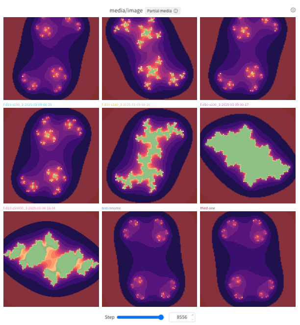 ## Add a media panel
You can add a media panel using Quick Add (which applies the default configuration) or by adding it manually so you can configure it as you create it. In either case, you can add the panel globally to the workspace or to a specific section.
To add a media panel for a logged key using the default configuration, use Quick Add:
1. **Global**: Click **Add panels** in the control bar near the panel search field.
2. **Section**: Click the section's **action ()** menu, then click **Add panels**.
3. In the list of available panels, find the key for the panel, then click **Add**. Repeat this step for each media panel you want to add, then click the **X** at the top right to close the **Quick Add** list.
4. Optionally, [configure the panel](#configure-a-media-panel).
To add a media panel manually so that you can configure it during creation:
1. **Global**: Click **Add panels** in the control bar near the panel search field.
2. **Section**: Click the section's **action ()** menu, then click **Add panels**.
3. Click the **Media** section to expand it.
4. Select the type of media the panel visualizes, 3D objects, images, video, or audio. The panel configuration screen displays. Configure the panel, then click **Apply**. Refer to [Configure a media panel](#configure-a-media-panel).
## Configure a media panel
When you add a media panel manually, its configuration page opens after you select the media type.
To configure an existing panel, hover over the panel and select the gear icon () in the upper-right corner. The following sections describe the settings available on each tab.
### Display
Configure the panel's appearance and behavior.
#### Viewer Settings
* **Panel title**: Specify the panel title.
* **Panel mode**: Specify the layout of the media panel. Choose from the following modes:
* **Gallery** (default): Specify the number of columns and whether the grid displays one item per run, step, or index. By default, the grid displays one item per run.
* **Grid**: Specify the number of columns, the x-axis, and the y-axis. By default, the x-axis is **Log Step** and the y-axis is **Run**.
* **Compare**: Compare up to four media items side by side. Optionally, fan out items by step or index. For more information, see [Compare mode](#compare-mode).
* **Media key(s)**: Logged W\&B fields that contain the images, videos, or other media the panel should display.
* **Slider key**: Specify the key to use for the panel's step slider. The default is **Step**.
#### Appearance
Configure how the panel displays media:
* **Smooth image**: Smooth images to improve their appearance.
#### Navigation & Playback
Control how you navigate through media logged at different points in a run:
* **Snap to step**: Toggle on or off. If on, the stepper advances to the next existing step after *Stride length*. Otherwise, **Snap to step** advances by **Stride length** even if it doesn't align with an existing step.
* **Stride length**: Specify the number of steps to advance each time you use the left and right (minus and plus buttons) during video playback. This setting is available only for video media panels.
* **Video seek step**: Specify how far to skip forward or backward when you use the left and right (minus and plus buttons) during video playback. This setting is available only for video media panels.
### Sync
Configure whether the step sliders for videos in the section move in sync. This setting is available only for video media panels.
#### Sync Video Playback
Synchronize video playback across media panels in the section.
* **Autoplay videos**: Start playing videos automatically when you open the workspace or panel.
* **Loop videos**: Restart videos automatically after playback ends.
### Layout
Configure how the panel arranges and displays individual media items.
#### Grid & Organization
* **Number of columns**: Specify the number of columns to display in the panel.
* **Column content**: Specify which dimension varies across columns:
* **Run**: Each column represents a different run.
* **Log Step**: Each column represents a different logging step from a run.
* **Example Index**: Each column represents a different index of the logged media. For example, if you log \[`img0`, `img1`, `img2`], the columns represent indices 0, 1, and 2.
* **Max runs to include**: Specify the maximum number of runs to display in the panel.
* **Media display limit**: Specify how many media items to display for each run:
* **Show all**: Display all media items logged for each run.
* **Limit media**: Limit the number of media items displayed for each run. Specify the maximum number of items to display.
#### Fit & Alignment
Configure how W\&B loads and scales media items.
Choose how you would like to display images in the panel within **Image fit and resolution** settings. Available options depend on your deployment type.
These settings have no effect in [**Compare** mode](#compare-mode).
For W\&B Multi-tenant Cloud:
* **Thumbnails** (default): Load smaller previews for faster loading. W\&B scales thumbnails to fit the panel.
* **Original image**: Load the full-resolution image file. W\&B scales the image to fit the panel.
For W\&B Dedicated Cloud and W\&B Self-Managed:
* **Default** (default): Use the default image dimensions for the panel mode.
For all deployment types:
* **Fit to available space**: Load the full-resolution image file and scale it to fill the panel. Scroll to view parts of the image that extend beyond the visible area.
* **Original size**: Load the full-resolution image file at its logged pixel dimensions. Scroll to view parts of the image that extend beyond the visible area.
On Multi-tenant Cloud, W\&B always loads full-resolution images in full-screen view, regardless of the media loading option selected for the panel.
Choose how videos appear in the panel:
These settings have no effect in [**Compare** mode](#compare-mode).
* **Use original size**: Display videos at their original dimensions in **Gallery** mode. If this option is off, W\&B scales videos to use as much panel space as possible while preserving the video's aspect ratio. In **Grid** mode, each video fills the grid width.
* **Disable video streaming**: Turn off streaming playback for videos.
Choose how 3D objects appear in the panel:
* **Right-handed system**: Plot point clouds with a right-handed coordinate system instead of the default left-handed coordinate system.
### Overlays
This tab appears for images and point clouds logged with segmentation masks or bounding boxes. Use it to:
* Search and filter overlays by name.
* Customize overlay colors.
## Configure all media panels in a section
Configure section-level defaults when you want every media panel in a section to share the same settings, overriding any workspace-level defaults.
To customize the default settings for all media panels in a section, overriding workspace settings for media panels:
1. Click the section's gear icon to open its settings.
2. Click **Media settings**.
3. Within the drawer that appears, click the **Display**, **Layout**, or **Sync** tab to configure the default media settings for the section. You can configure settings for images, videos, audio, and 3D objects. The settings that appear depend on the section's current media panels.
Refer to [Configure a media panel](#configure-a-media-panel) for details about a specific setting for **Display** or **Layout** media setting. The **Sync** tab is available only at the section or workspace level, not for individual media panels.
When **Step slider syncing** is turned on, the section's media panels with the same step slider are kept in sync. To turn on step slider syncing:
1. Click the **Sync** tab.
2. Turn on **Sync slider by key (Step)**.
## Configure all media panels in a workspace
Configure workspace-level defaults when you want a consistent baseline for media panels across every section in the workspace.
To customize the default settings for all media panels in a workspace:
1. Click the workspace's settings, which has a gear with the label **Settings**.
2. Click **Media settings**.
3. Within the drawer that appears, click the **Display** or **Layout** tab to configure the default media settings for the workspace. You can configure settings for images, videos, audio, and 3D objects. The settings that appear depend on the workspace's current media panels.
Except for the **Sync** tab, refer to [Configure a media panel](#configure-a-media-panel) for details about a setting. The **Sync** tab is available only at the section or workspace level, not for individual media panels.
When **Step slider syncing** is turned on, the section's media panels with the same step slider are kept in sync. To turn on step slider syncing:
1. Click the **Sync** tab.
2. Turn on **Sync slider by key (Step)**.
For details about each setting, refer to [Configure a media panel](#configure-a-media-panel).
## Compare mode
Compare mode lets you select two to four images or videos from any combination of runs, steps, or indices and view them in a single grid. You can compare media without downloading one or more files or switching tabs.
Use compare mode to:
* Confirm that a new checkpoint or run produces better outputs than a baseline or previous checkpoint.
* Catch regressions by comparing the current run to a known good checkpoint at the same step or index.
* Validate model outputs against ground truth by viewing reference and generated media side by side.
* Review how generated images or videos change across training steps or across different checkpoints or runs.
Compare mode is useful for image or video generation workflows like diffusion or generative models, multimodal evaluation, vision experiments, and other workflows where you log media and need to compare it across runs, steps, or indices.
To use compare mode:
1. Open a media panel in your workspace (for images or video).
2. Set **Panel mode** to **Compare**.
3. Configure the grid's dimensions and density by specifying the number of columns and the fan-out mode. The best grid geometry depends on how your runs log media.
* **Number of columns**: How many items to show per row, from `1` to `4`.
* **Fan out**: Control the granularity of media to display per grid row. The best setting depends on how many media items you log per step per run, and whether you need a quick spot check or deep analysis.
* **None** (default): No fan-out. Each grid column represents a run, and each grid row represents a logged image or video.
## Add a media panel
You can add a media panel using Quick Add (which applies the default configuration) or by adding it manually so you can configure it as you create it. In either case, you can add the panel globally to the workspace or to a specific section.
To add a media panel for a logged key using the default configuration, use Quick Add:
1. **Global**: Click **Add panels** in the control bar near the panel search field.
2. **Section**: Click the section's **action ()** menu, then click **Add panels**.
3. In the list of available panels, find the key for the panel, then click **Add**. Repeat this step for each media panel you want to add, then click the **X** at the top right to close the **Quick Add** list.
4. Optionally, [configure the panel](#configure-a-media-panel).
To add a media panel manually so that you can configure it during creation:
1. **Global**: Click **Add panels** in the control bar near the panel search field.
2. **Section**: Click the section's **action ()** menu, then click **Add panels**.
3. Click the **Media** section to expand it.
4. Select the type of media the panel visualizes, 3D objects, images, video, or audio. The panel configuration screen displays. Configure the panel, then click **Apply**. Refer to [Configure a media panel](#configure-a-media-panel).
## Configure a media panel
When you add a media panel manually, its configuration page opens after you select the media type.
To configure an existing panel, hover over the panel and select the gear icon () in the upper-right corner. The following sections describe the settings available on each tab.
### Display
Configure the panel's appearance and behavior.
#### Viewer Settings
* **Panel title**: Specify the panel title.
* **Panel mode**: Specify the layout of the media panel. Choose from the following modes:
* **Gallery** (default): Specify the number of columns and whether the grid displays one item per run, step, or index. By default, the grid displays one item per run.
* **Grid**: Specify the number of columns, the x-axis, and the y-axis. By default, the x-axis is **Log Step** and the y-axis is **Run**.
* **Compare**: Compare up to four media items side by side. Optionally, fan out items by step or index. For more information, see [Compare mode](#compare-mode).
* **Media key(s)**: Logged W\&B fields that contain the images, videos, or other media the panel should display.
* **Slider key**: Specify the key to use for the panel's step slider. The default is **Step**.
#### Appearance
Configure how the panel displays media:
* **Smooth image**: Smooth images to improve their appearance.
#### Navigation & Playback
Control how you navigate through media logged at different points in a run:
* **Snap to step**: Toggle on or off. If on, the stepper advances to the next existing step after *Stride length*. Otherwise, **Snap to step** advances by **Stride length** even if it doesn't align with an existing step.
* **Stride length**: Specify the number of steps to advance each time you use the left and right (minus and plus buttons) during video playback. This setting is available only for video media panels.
* **Video seek step**: Specify how far to skip forward or backward when you use the left and right (minus and plus buttons) during video playback. This setting is available only for video media panels.
### Sync
Configure whether the step sliders for videos in the section move in sync. This setting is available only for video media panels.
#### Sync Video Playback
Synchronize video playback across media panels in the section.
* **Autoplay videos**: Start playing videos automatically when you open the workspace or panel.
* **Loop videos**: Restart videos automatically after playback ends.
### Layout
Configure how the panel arranges and displays individual media items.
#### Grid & Organization
* **Number of columns**: Specify the number of columns to display in the panel.
* **Column content**: Specify which dimension varies across columns:
* **Run**: Each column represents a different run.
* **Log Step**: Each column represents a different logging step from a run.
* **Example Index**: Each column represents a different index of the logged media. For example, if you log \[`img0`, `img1`, `img2`], the columns represent indices 0, 1, and 2.
* **Max runs to include**: Specify the maximum number of runs to display in the panel.
* **Media display limit**: Specify how many media items to display for each run:
* **Show all**: Display all media items logged for each run.
* **Limit media**: Limit the number of media items displayed for each run. Specify the maximum number of items to display.
#### Fit & Alignment
Configure how W\&B loads and scales media items.
Choose how you would like to display images in the panel within **Image fit and resolution** settings. Available options depend on your deployment type.
These settings have no effect in [**Compare** mode](#compare-mode).
For W\&B Multi-tenant Cloud:
* **Thumbnails** (default): Load smaller previews for faster loading. W\&B scales thumbnails to fit the panel.
* **Original image**: Load the full-resolution image file. W\&B scales the image to fit the panel.
For W\&B Dedicated Cloud and W\&B Self-Managed:
* **Default** (default): Use the default image dimensions for the panel mode.
For all deployment types:
* **Fit to available space**: Load the full-resolution image file and scale it to fill the panel. Scroll to view parts of the image that extend beyond the visible area.
* **Original size**: Load the full-resolution image file at its logged pixel dimensions. Scroll to view parts of the image that extend beyond the visible area.
On Multi-tenant Cloud, W\&B always loads full-resolution images in full-screen view, regardless of the media loading option selected for the panel.
Choose how videos appear in the panel:
These settings have no effect in [**Compare** mode](#compare-mode).
* **Use original size**: Display videos at their original dimensions in **Gallery** mode. If this option is off, W\&B scales videos to use as much panel space as possible while preserving the video's aspect ratio. In **Grid** mode, each video fills the grid width.
* **Disable video streaming**: Turn off streaming playback for videos.
Choose how 3D objects appear in the panel:
* **Right-handed system**: Plot point clouds with a right-handed coordinate system instead of the default left-handed coordinate system.
### Overlays
This tab appears for images and point clouds logged with segmentation masks or bounding boxes. Use it to:
* Search and filter overlays by name.
* Customize overlay colors.
## Configure all media panels in a section
Configure section-level defaults when you want every media panel in a section to share the same settings, overriding any workspace-level defaults.
To customize the default settings for all media panels in a section, overriding workspace settings for media panels:
1. Click the section's gear icon to open its settings.
2. Click **Media settings**.
3. Within the drawer that appears, click the **Display**, **Layout**, or **Sync** tab to configure the default media settings for the section. You can configure settings for images, videos, audio, and 3D objects. The settings that appear depend on the section's current media panels.
Refer to [Configure a media panel](#configure-a-media-panel) for details about a specific setting for **Display** or **Layout** media setting. The **Sync** tab is available only at the section or workspace level, not for individual media panels.
When **Step slider syncing** is turned on, the section's media panels with the same step slider are kept in sync. To turn on step slider syncing:
1. Click the **Sync** tab.
2. Turn on **Sync slider by key (Step)**.
## Configure all media panels in a workspace
Configure workspace-level defaults when you want a consistent baseline for media panels across every section in the workspace.
To customize the default settings for all media panels in a workspace:
1. Click the workspace's settings, which has a gear with the label **Settings**.
2. Click **Media settings**.
3. Within the drawer that appears, click the **Display** or **Layout** tab to configure the default media settings for the workspace. You can configure settings for images, videos, audio, and 3D objects. The settings that appear depend on the workspace's current media panels.
Except for the **Sync** tab, refer to [Configure a media panel](#configure-a-media-panel) for details about a setting. The **Sync** tab is available only at the section or workspace level, not for individual media panels.
When **Step slider syncing** is turned on, the section's media panels with the same step slider are kept in sync. To turn on step slider syncing:
1. Click the **Sync** tab.
2. Turn on **Sync slider by key (Step)**.
For details about each setting, refer to [Configure a media panel](#configure-a-media-panel).
## Compare mode
Compare mode lets you select two to four images or videos from any combination of runs, steps, or indices and view them in a single grid. You can compare media without downloading one or more files or switching tabs.
Use compare mode to:
* Confirm that a new checkpoint or run produces better outputs than a baseline or previous checkpoint.
* Catch regressions by comparing the current run to a known good checkpoint at the same step or index.
* Validate model outputs against ground truth by viewing reference and generated media side by side.
* Review how generated images or videos change across training steps or across different checkpoints or runs.
Compare mode is useful for image or video generation workflows like diffusion or generative models, multimodal evaluation, vision experiments, and other workflows where you log media and need to compare it across runs, steps, or indices.
To use compare mode:
1. Open a media panel in your workspace (for images or video).
2. Set **Panel mode** to **Compare**.
3. Configure the grid's dimensions and density by specifying the number of columns and the fan-out mode. The best grid geometry depends on how your runs log media.
* **Number of columns**: How many items to show per row, from `1` to `4`.
* **Fan out**: Control the granularity of media to display per grid row. The best setting depends on how many media items you log per step per run, and whether you need a quick spot check or deep analysis.
* **None** (default): No fan-out. Each grid column represents a run, and each grid row represents a logged image or video.
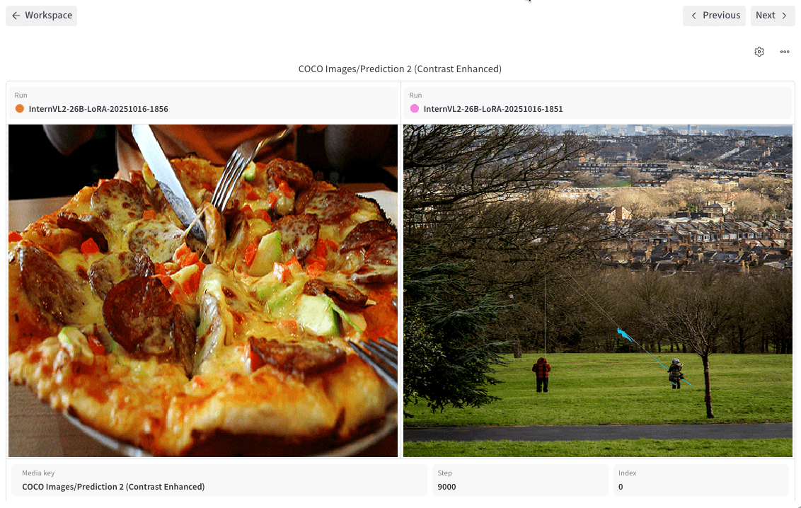 * **Step**: Fan out along the step axis. Each grid column represents a run, and each grid row shows the first image or video logged at a run:step combination.
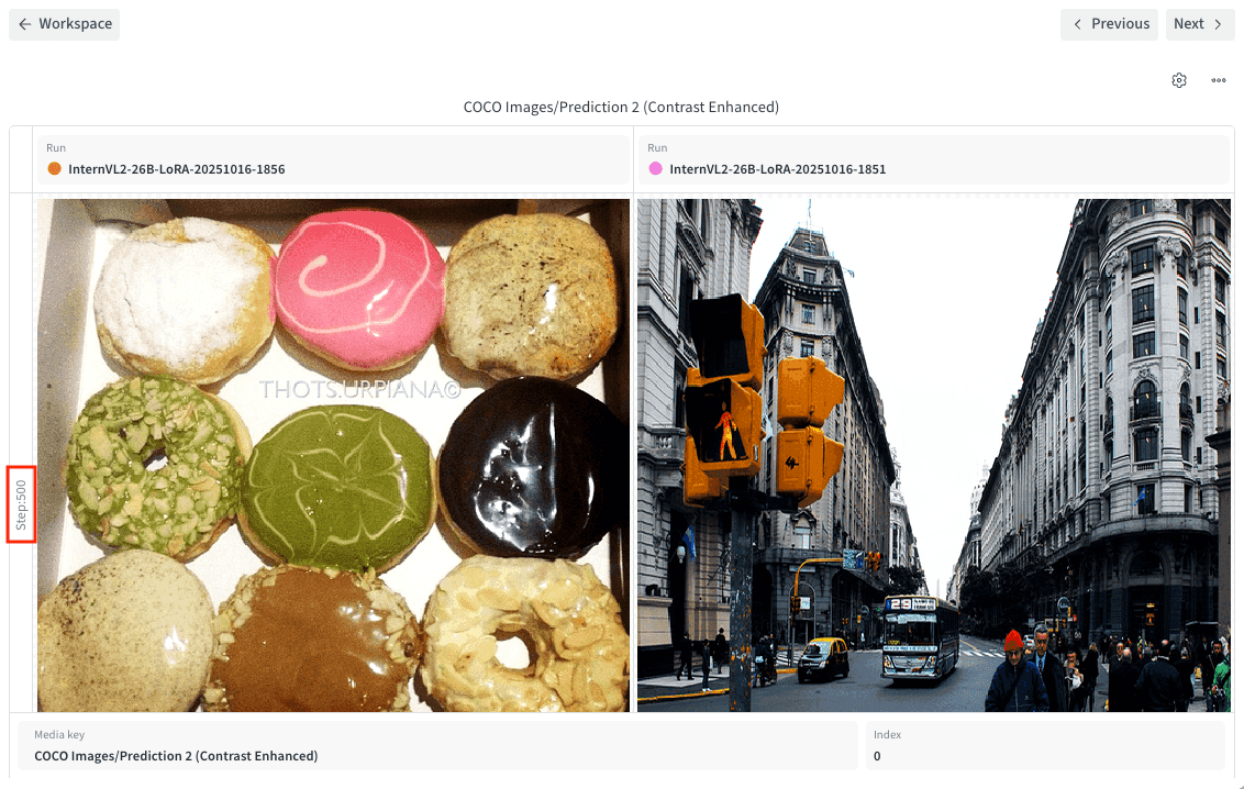 * **Index**: Fan out along the index axis, useful when you log several items per step (for example, `run.log({"images": [img0, img1, img2, img3]})`). Each row cell shows the image or video logged at a given run:step:index combination.
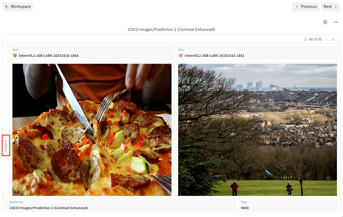 4. Configure whether a given variable affects a single tile (**Individual**) or all tiles (**Linked**).
* **Media key**: Defaults to **Linked**.
* **Run**: Defaults to **Individual**.
* **Step**: Defaults to **Linked**.
* **Index**: Defaults to **Linked**.
W\&B saves your selection so you can return to the same comparison later without reconfiguring the panel.
## Interact with a media panel
After you add and configure a media panel, use the following interactions to step through, compare, and inspect logged media:
* To configure a media panel, hover over it and click the gear icon at the top.
* To move a media panel's step slider, use **Cmd + left or right arrow key** (macOS) or **Ctrl + left or right arrow key** (Windows or Linux). If **Sync slider by key** is turned on for the section or workspace, moving the step slider in one media panel also moves the step slider in other media panels with the same step slider key.
* Use the stepper at the top of a media panel to step through media runs. To move the step slider, use the UI controls.
* Click a media panel to view it in full-screen mode. Click the arrow button at the top of the panel to exit full-screen mode.
* To navigate through a section's panels without exiting full-screen mode, use either the **Previous** and **Next** buttons below the panel or the left and right arrow keys.
* When viewing an image in full-screen mode, click the zoom control at the top right to zoom in or out. By default, images zoom to fit. Click and drag to pan a zoomed-in image. You can also zoom in, zoom out, reset to 100% zoom, or zoom to fit using keyboard shortcuts. See [Keyboard shortcuts](/models/app/keyboard-shortcuts#media-panels).
* For an image that was logged with segmentation masks, you can customize their appearance or turn each one on or off. Hover over the panel, then click the lower gear icon.
* For an image or point cloud that was logged with bounding boxes, you can customize their appearance or turn each one on or off. Hover over the panel, then click the lower gear icon.
* Use the media controls to play, pause, or stop video playback. Use the left and right arrow keys to skip forward or backward by the configured **video seek step**. If **Sync video playback** is turned on, all videos in the section play in sync. If **Loop videos** is turned on, videos in the section restart automatically and play continuously until stopped.
4. Configure whether a given variable affects a single tile (**Individual**) or all tiles (**Linked**).
* **Media key**: Defaults to **Linked**.
* **Run**: Defaults to **Individual**.
* **Step**: Defaults to **Linked**.
* **Index**: Defaults to **Linked**.
W\&B saves your selection so you can return to the same comparison later without reconfiguring the panel.
## Interact with a media panel
After you add and configure a media panel, use the following interactions to step through, compare, and inspect logged media:
* To configure a media panel, hover over it and click the gear icon at the top.
* To move a media panel's step slider, use **Cmd + left or right arrow key** (macOS) or **Ctrl + left or right arrow key** (Windows or Linux). If **Sync slider by key** is turned on for the section or workspace, moving the step slider in one media panel also moves the step slider in other media panels with the same step slider key.
* Use the stepper at the top of a media panel to step through media runs. To move the step slider, use the UI controls.
* Click a media panel to view it in full-screen mode. Click the arrow button at the top of the panel to exit full-screen mode.
* To navigate through a section's panels without exiting full-screen mode, use either the **Previous** and **Next** buttons below the panel or the left and right arrow keys.
* When viewing an image in full-screen mode, click the zoom control at the top right to zoom in or out. By default, images zoom to fit. Click and drag to pan a zoomed-in image. You can also zoom in, zoom out, reset to 100% zoom, or zoom to fit using keyboard shortcuts. See [Keyboard shortcuts](/models/app/keyboard-shortcuts#media-panels).
* For an image that was logged with segmentation masks, you can customize their appearance or turn each one on or off. Hover over the panel, then click the lower gear icon.
* For an image or point cloud that was logged with bounding boxes, you can customize their appearance or turn each one on or off. Hover over the panel, then click the lower gear icon.
* Use the media controls to play, pause, or stop video playback. Use the left and right arrow keys to skip forward or backward by the configured **video seek step**. If **Sync video playback** is turned on, all videos in the section play in sync. If **Loop videos** is turned on, videos in the section restart automatically and play continuously until stopped.